HealthPartners is an integrated, nonprofit health care and health insurance company providing coverage, research, and education to its members, patients and the community. As the lead designer, I collaborated with a researcher and accessibility expert on this project.
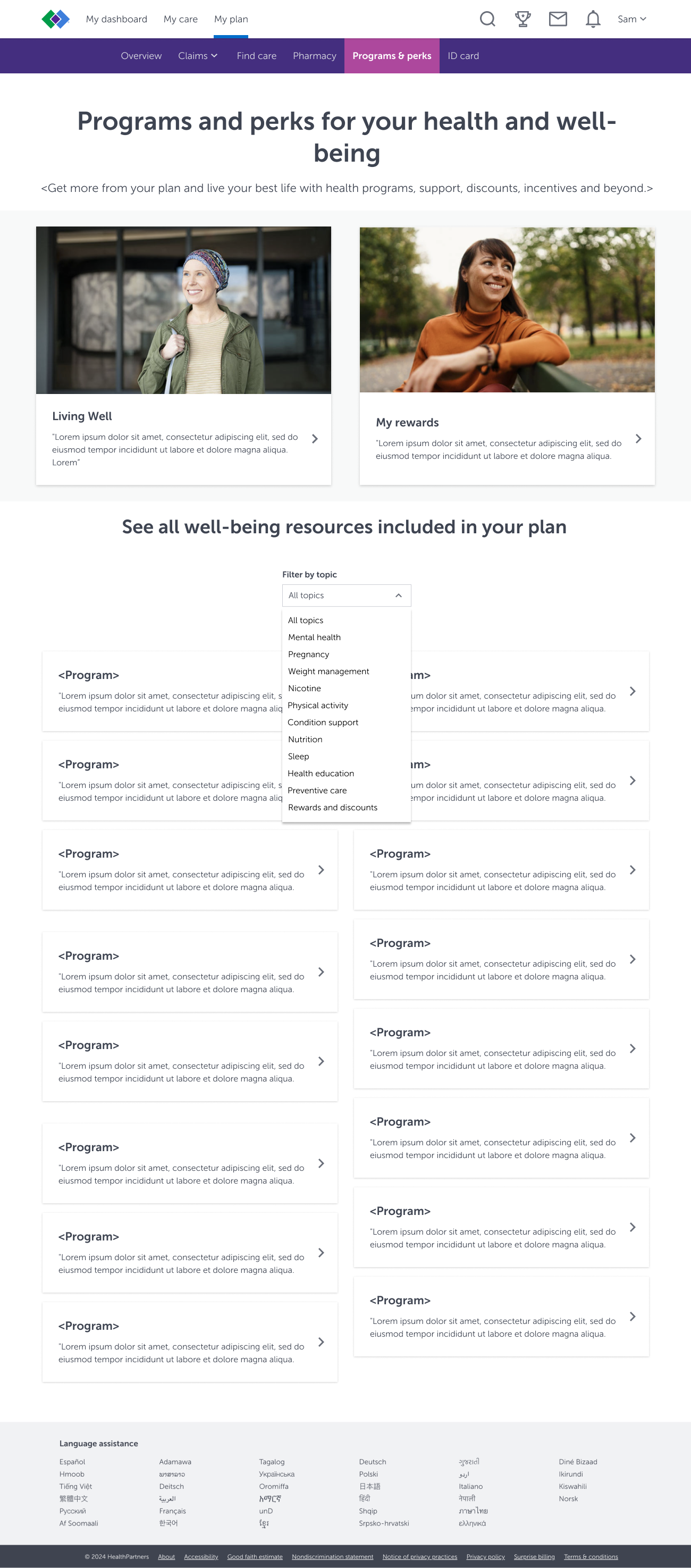
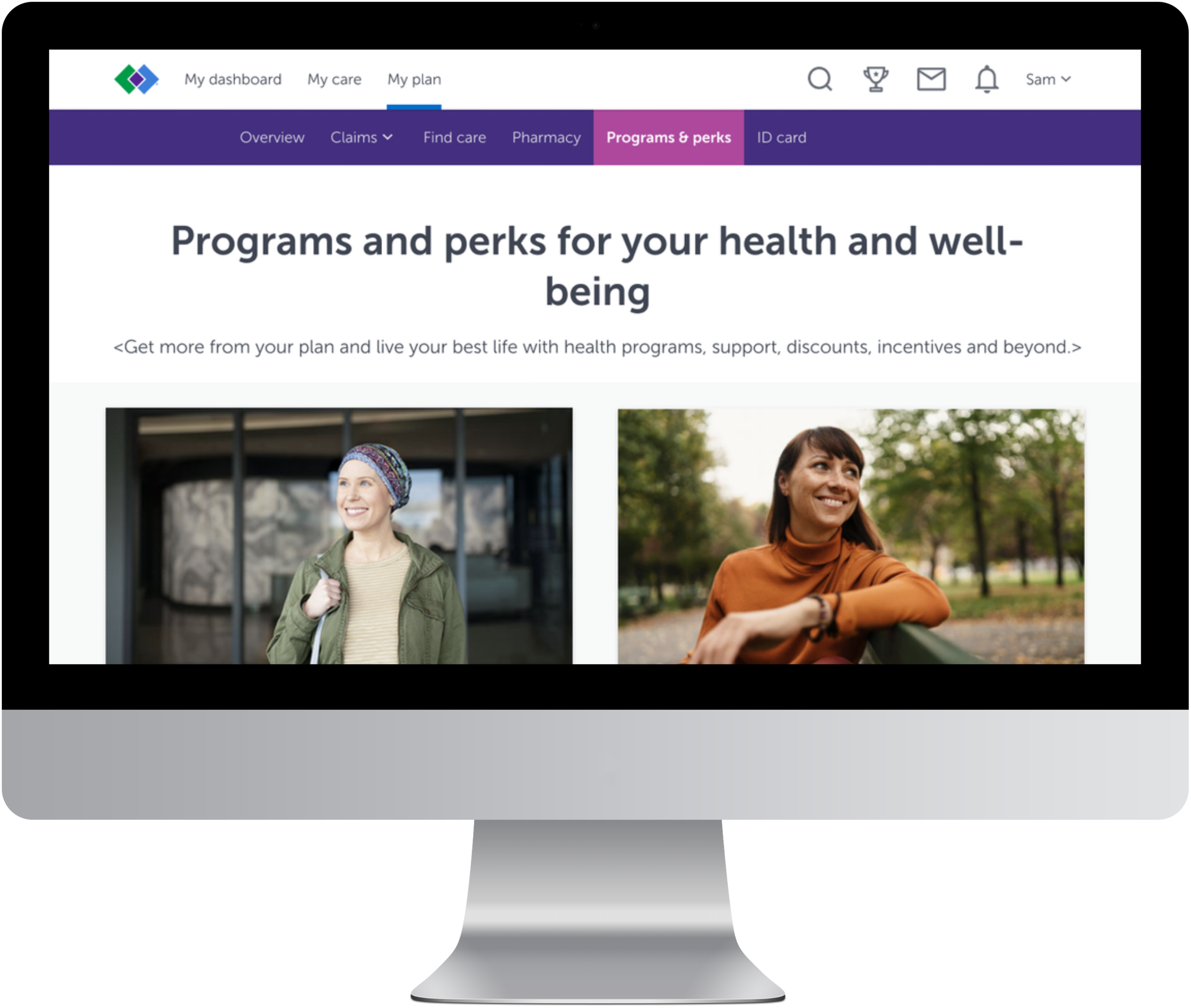
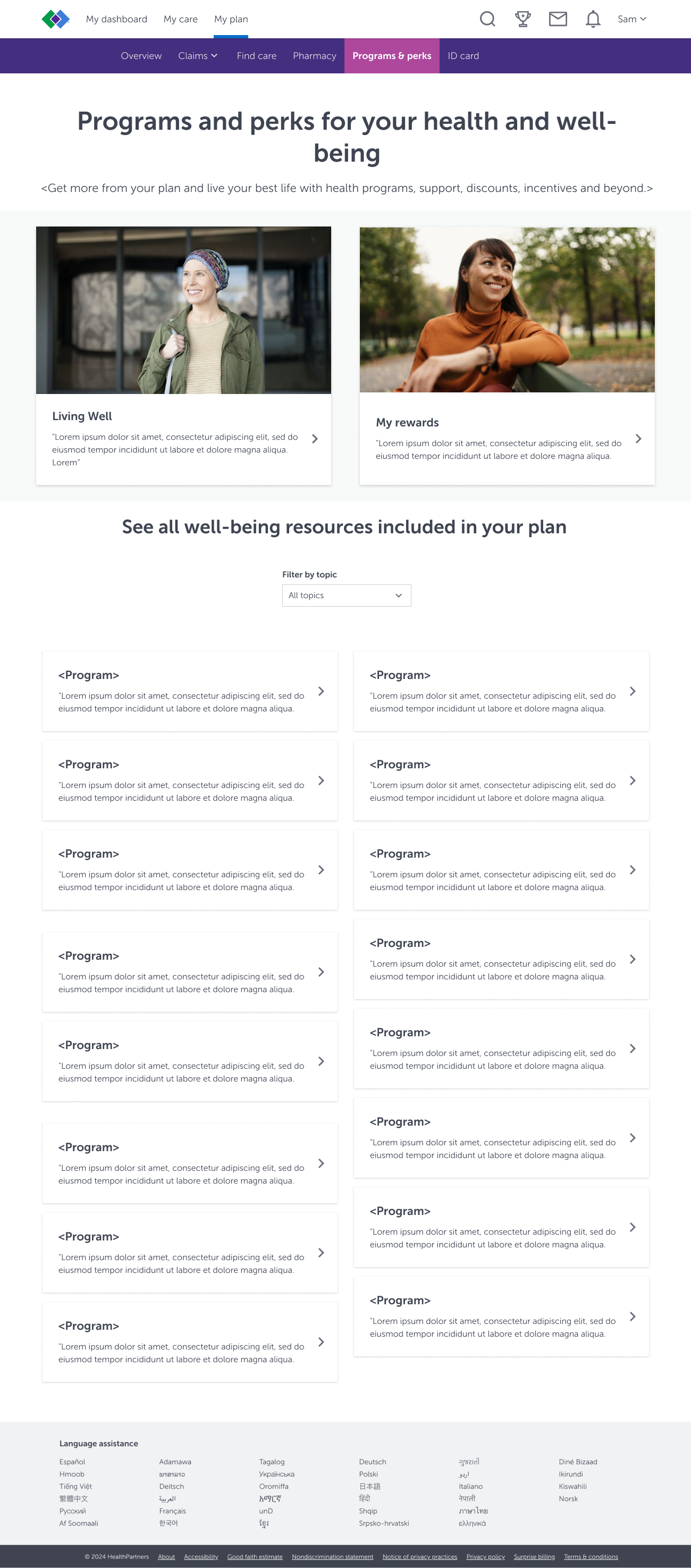
Directly below, I share a side-by-side comparison of the previous and newer redesigned version of the Member Programs Page. Key changes I suggest include improved visual hierarchy, a centralized location for all health plan offerings and a drop down filter. These changes will ensure an easier way for users to find the most beneficial programs for their unique needs. "Living Well" and "My Rewards" are featured prominently because these programs are the most profitable for the company.
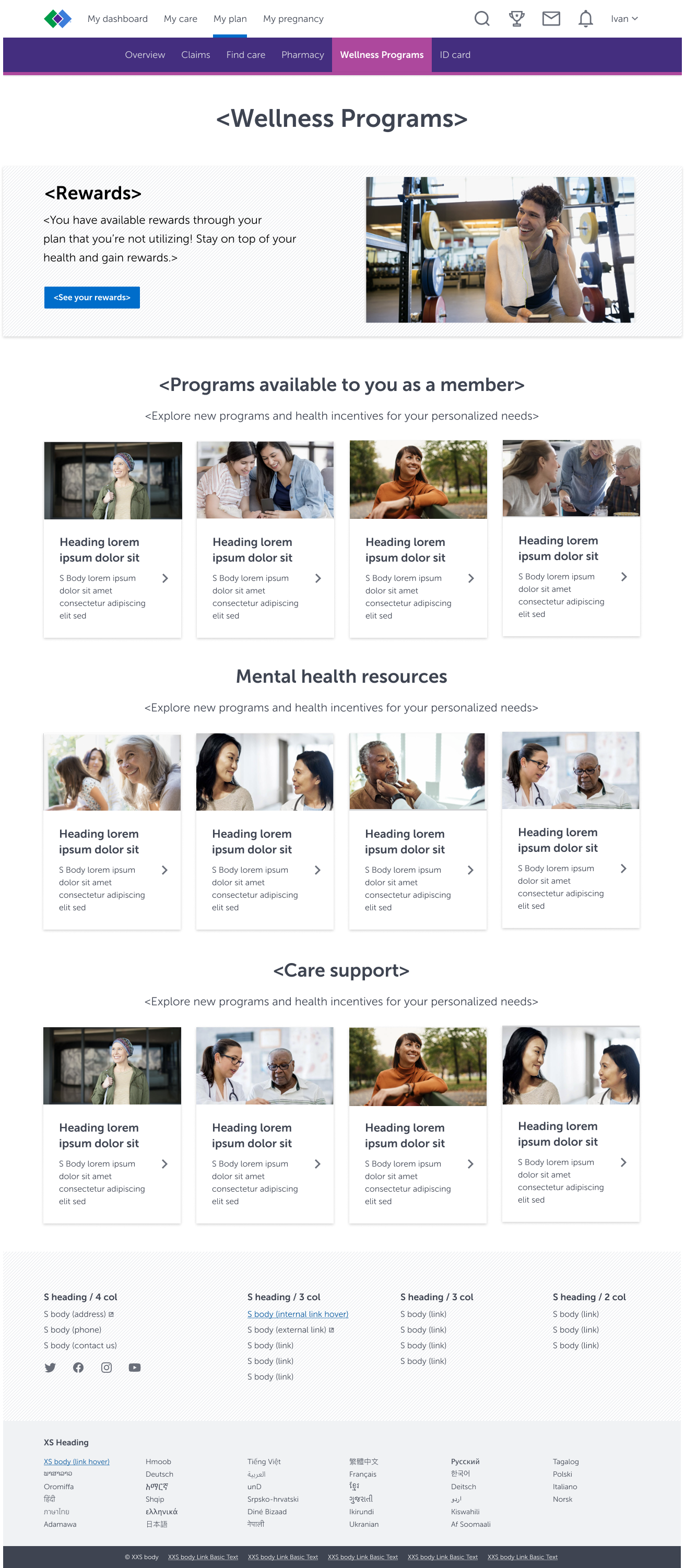
Before
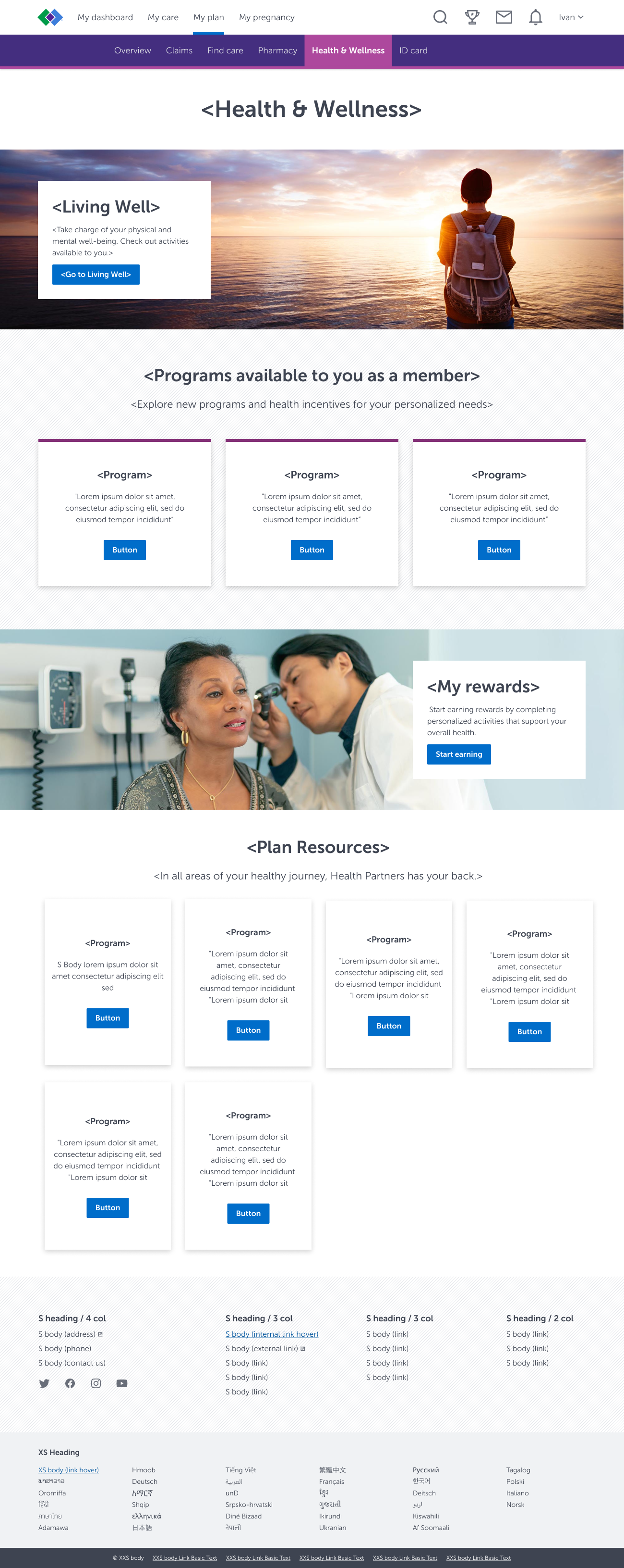
After
Rapid Ideation & Brainstorming Sessions
This proposed redesign is a complex and high-visibility project which involved many internal stakeholders and several third-party vendors. I facilitated a series of six hour-long brainstorming sessions with multiple stakeholders to understand and calibrate all objectives. I conducted these sessions in a Miro board where each participant provided their insight via sticky notes. Below I share three potential designs I created. While I made them, I ensured I implemented stakeholder feedback, the best design principles, and honored the standards of the Health Partners pattern library.
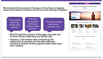
Moderated Usability Tests With Health Partner Members
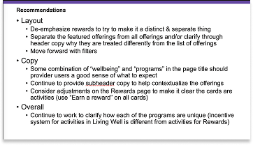
I facilitated moderated in-depth usability tests with a total of five Health Partner Members. Users were tasked to locate specific programs and share their impressions on our proposed redesigned page. Below, I share the design that I used in the study, along with findings which shaped the final design. I presented the result of the study to all stakeholders.
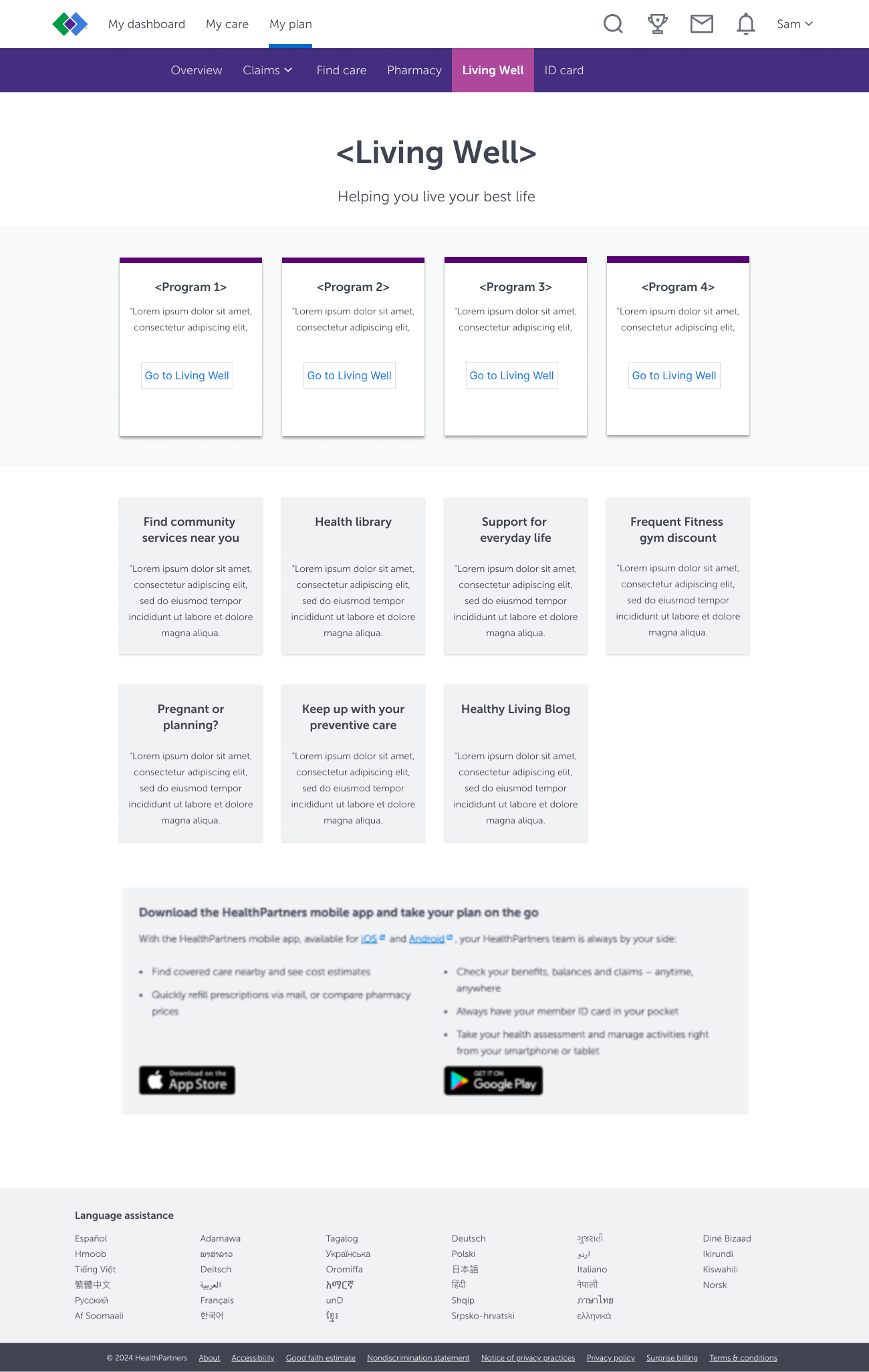
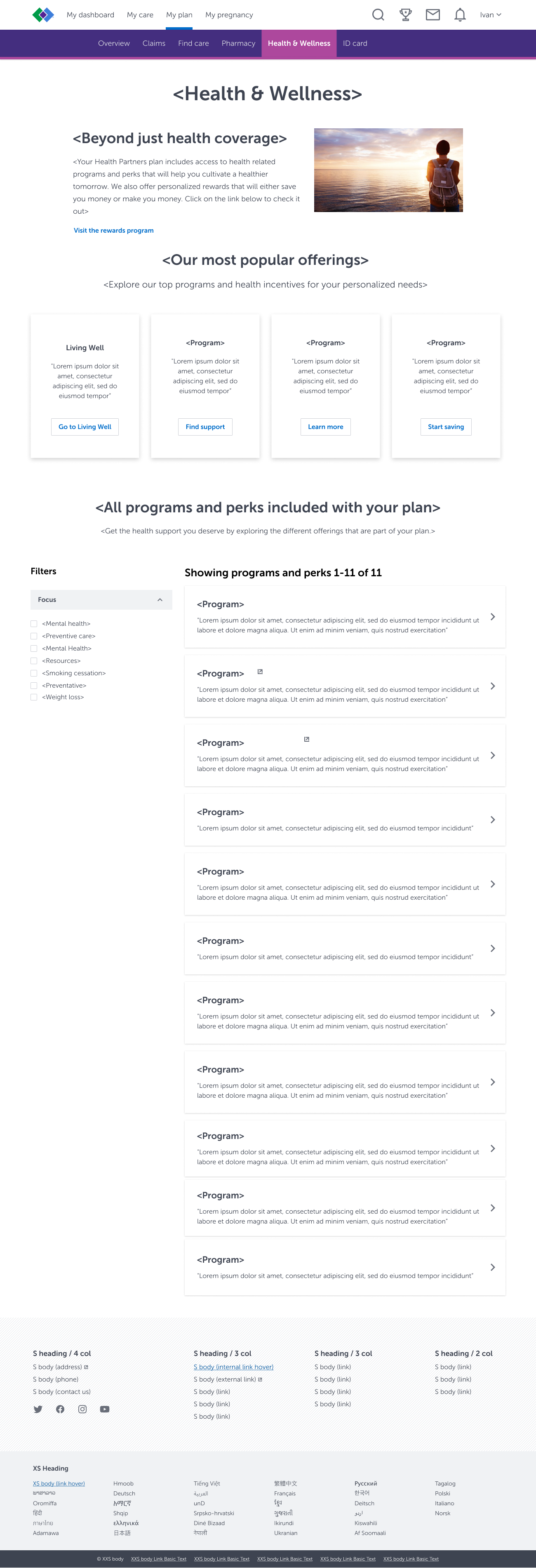
Below, I share the final design that allows stakeholders to determine which programs they want to showcase prominently. In this iteration, "Living Well" and "My Rewards" were programs the business wanted to prioritize in 2025. As such, they are displayed prominently in image cards. As a user scrolls down the page a list of all available programs and perks appear. The number of cards that populate within the page will vary, and correspond with a specific user’s health conditions. I also incorporated a drop down filter to allow users the ability to filter the programs based on what they want to explore.