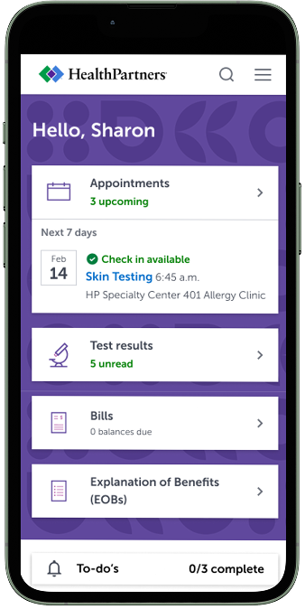
HealthPartners members and member patients have access to the "authenticated experience" where they accomplish key tasks. The click-through rate on the campaign cards is low and the assumption is that users don't feel that the offerings presented are personalized to them. It is important for members to engage with HealthPartners and third-party programs to improve healthcare outcomes.
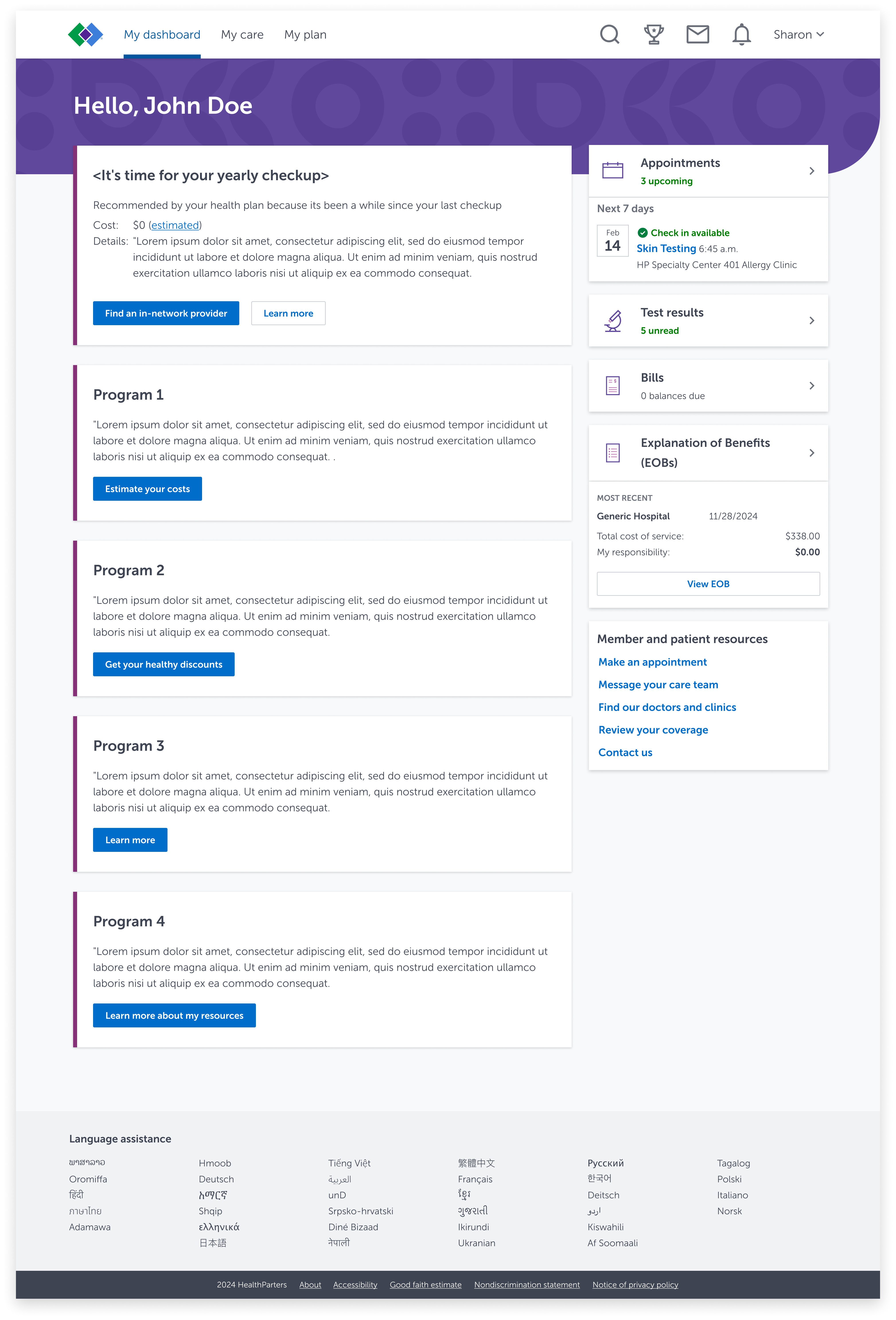
Directly below, I share both the desktop and mobile version of the "My Dashboard" page. In my research, users shared they find the "Appointments, Test Results and Bills" cards useful but they do not engage with the program cards as often. Their rationale for low engagement is that cards come across as generic and didn't feel like it addressed their personal health needs. Users have also indicated that this page should be more personalized.
Desktop
Mobile

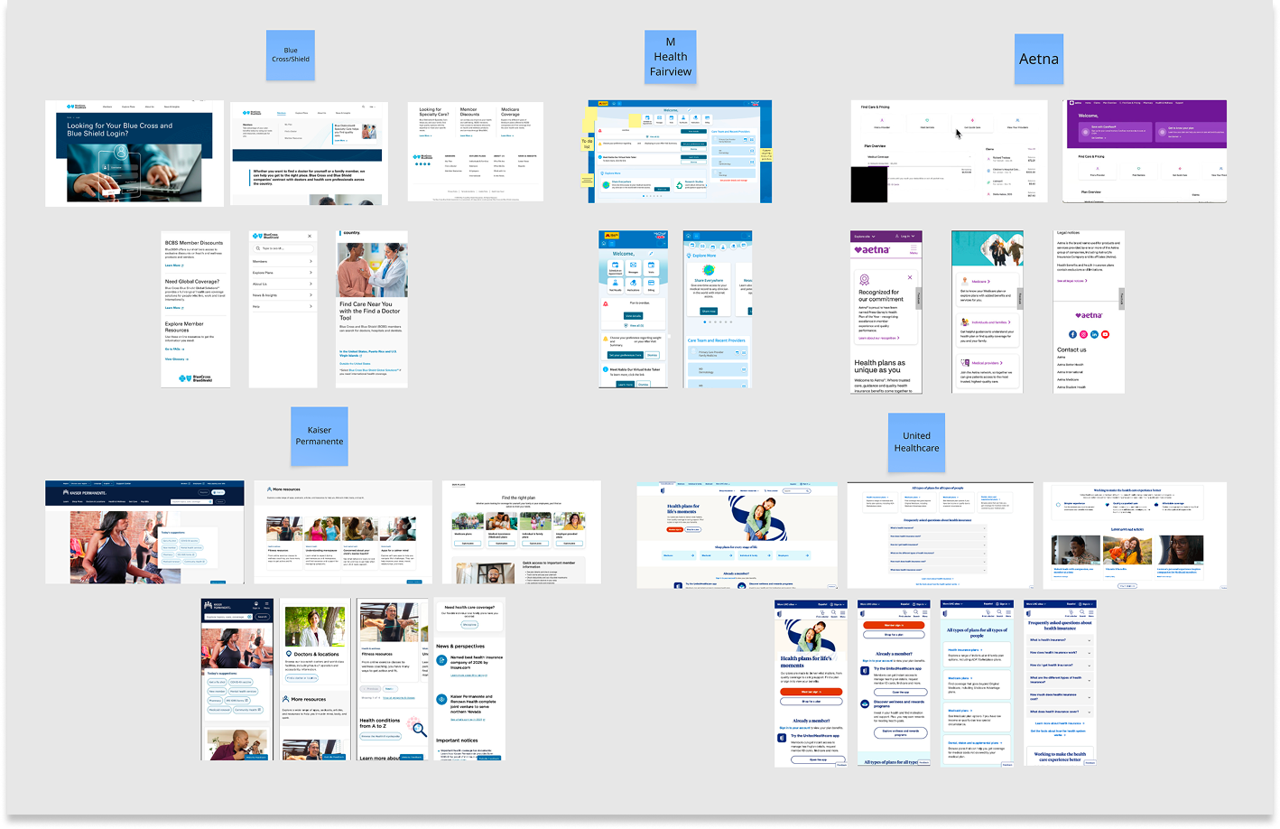
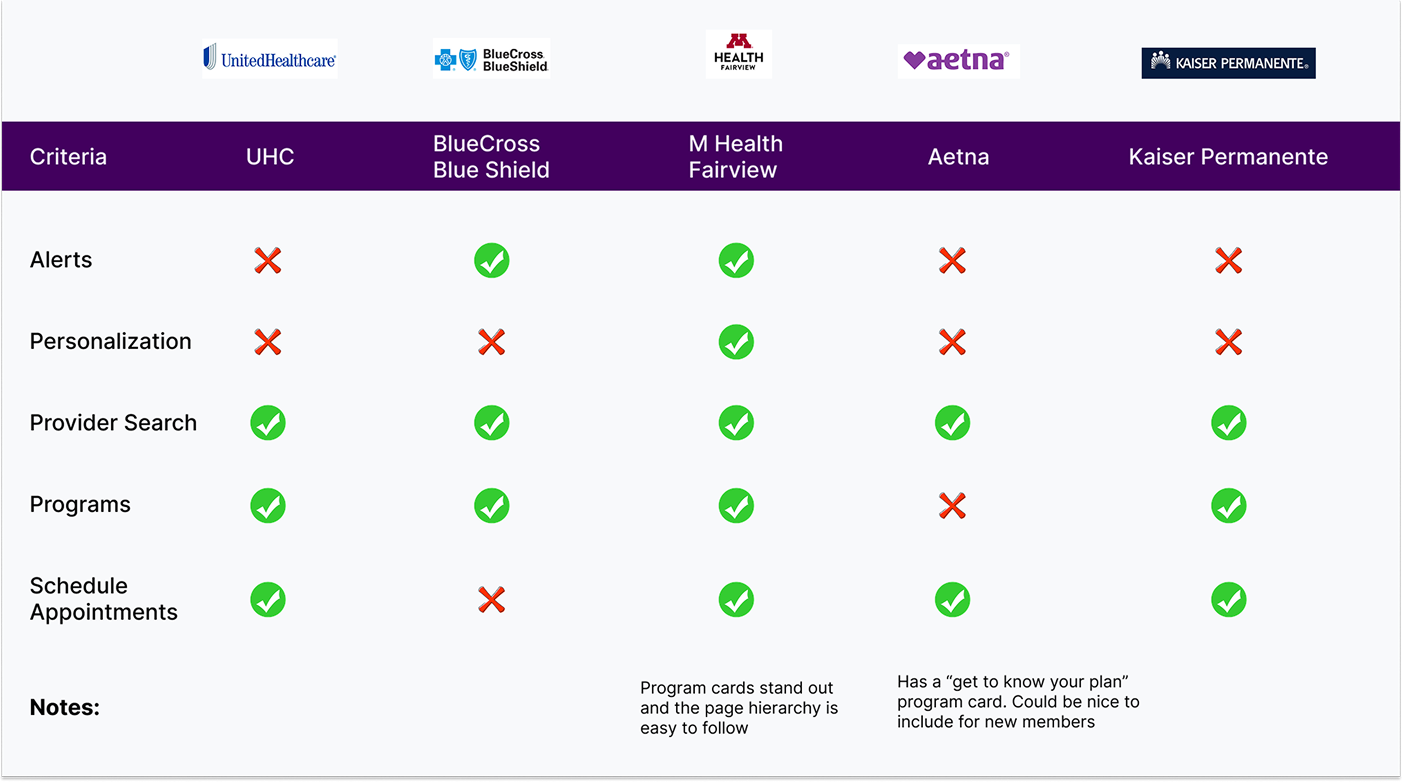
From analyzing these competitors, I found an opportunity to rework the card hierarchy on the page and update the copy to feel more personalized. I also concluded to change the page layout to show a proper dashboard where users can see vital information. This will encourage them to take actions that will improve their overall health and well-being.
I started drawing some ideation sketches of what an updated My Dashboard page could look like on mobile. I ideated three different options that focused on making the information more personalized for users based on their unique health needs. I am also thinking about ways to include shortcuts to commonly visited pages within the authenticated experience.
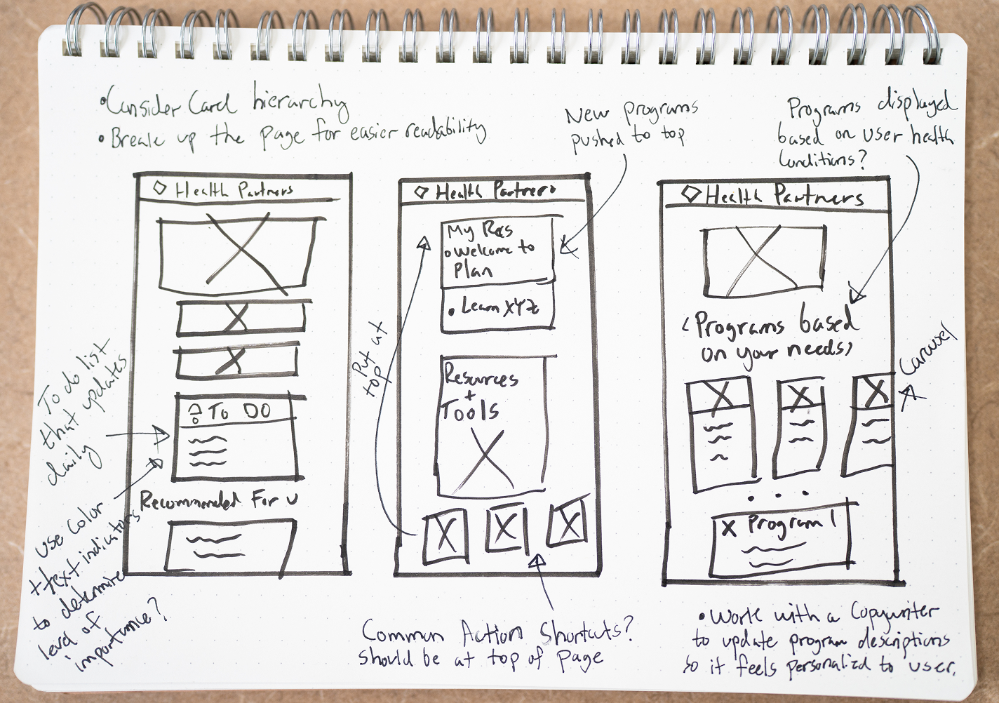
I then translated my sketches into my first set of low fidelity wireframes and presented it to stakeholders and other designers on my team. I took their feedback and implemented it into the high fidelity designs.
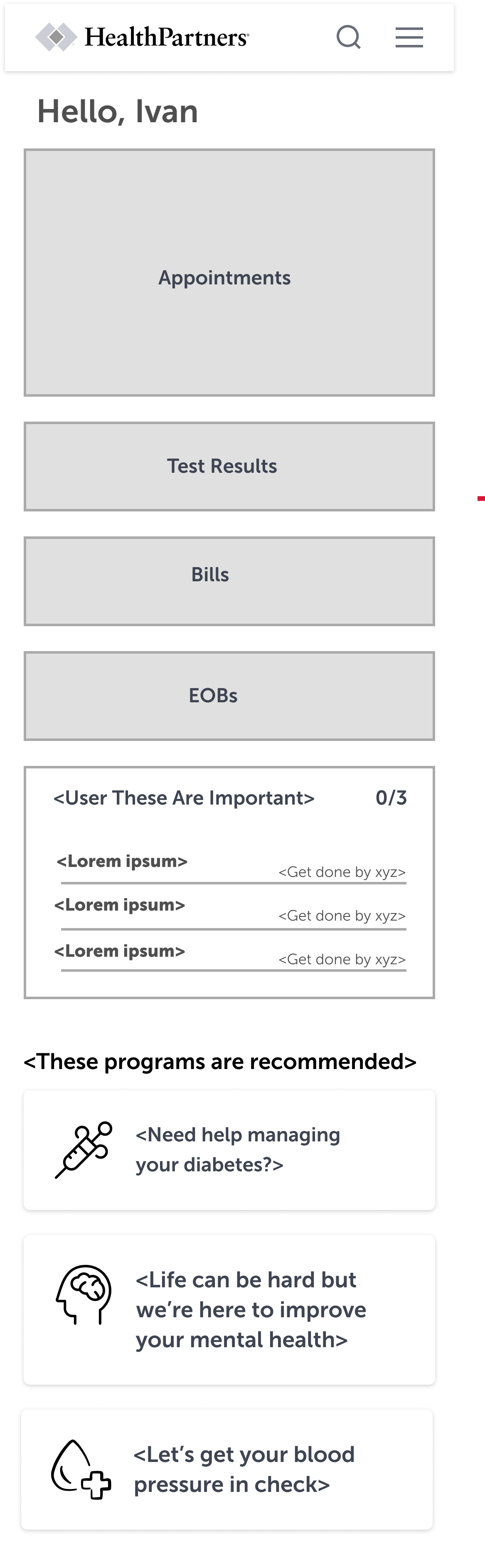
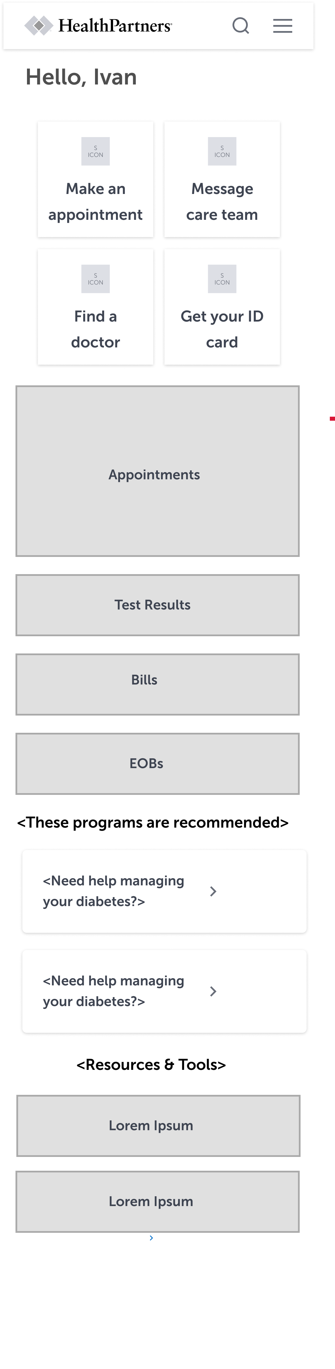
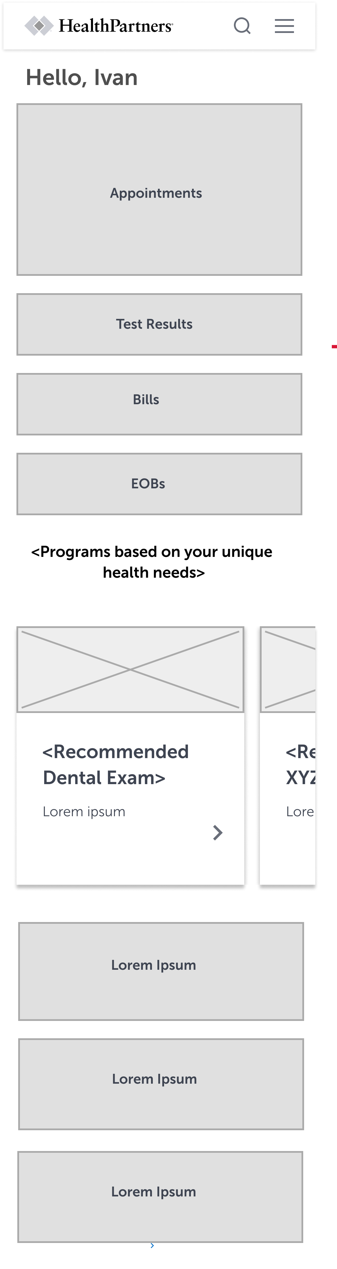
Below I proposed high fidelity wireframes to be used in future moderated usability tests. Due to financial reasons this project was paused indefinitely, so we have not conducted user testing.
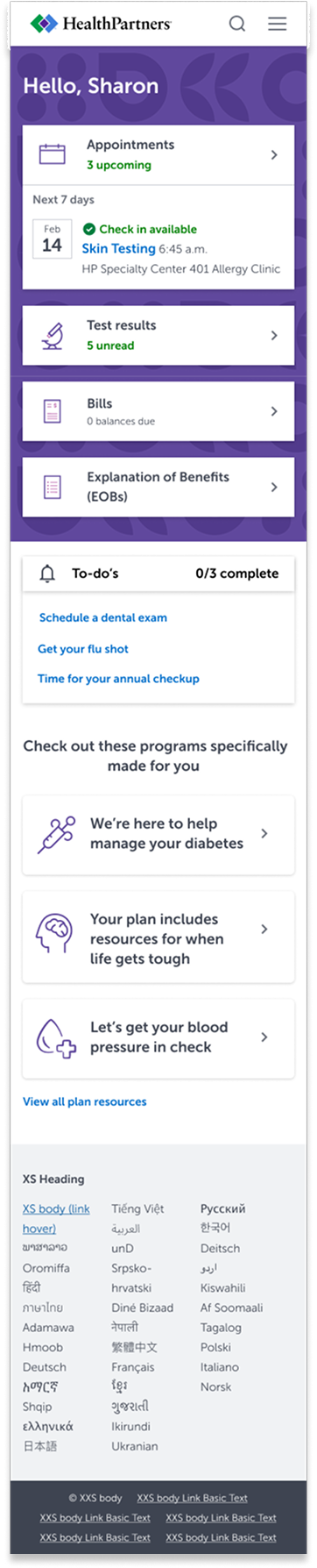


I contend that moderated usability studies with both HealthPartners members and non-members would provide the necessary feedback to arrive at a successful final design. I would benefit from working with a copywriter to ensure that the language in this design ensures that offerings on this page are tailored specifically for that user. Between 2-4 weeks after the design is live, I would gather data on click through analytics and make adjustments if needed.
My biggest takeaway from this project is the importance of demonstrating empathy in healthcare user interface design. When people normally deal with healthcare or health insurance it can be under stressful circumstances. Creating meaningful and intentional designs can reduce additional stressors. I am thrilled to be a part of utilizing technology to act as a bridge toward healing and hope.